Toon Mayhem
Toon Mayhem is a local multiplayer arcade action game that was developed in 9 months by a 12 person interdisciplinary team.
The cartoon tank kingdoms are being invaded by the toon army and you must defend your castle by defeating them and sending them to your opponents kingdoms. Choose from 3 tank heroes and battle through hordes of enemies, competing with your opponent to claim victory. Including bosses, pick-ups and level mechanics to keep you on your toes!
I was Lead Designer for this project and worked closely alongside programmers, artists and other designers. My responsibilities included:
- Creating and maintaining the Game Design Document.
- Working with the programmers to prototype, develop and refine gameplay mechanics.
- Implementing feedback from playtests.
- Helping to scope and schedule the developement of the game.
Along with the Lead Tech of Toon Mayhem, I understood the technical constraints of the engine and the workflow of the game editor so we conceptilized several ideas for the game levels which fed in to the initial design pitch. After some collaboration with the team one idea was decided and I began planning, prototyping and creating a high-level document for the level design pipeline.
Using our weekly playtesting sessions I was able to collect and analyse playtest data and feedback, and iterate on layouts accordingly in collaboration with other designers and artists.**
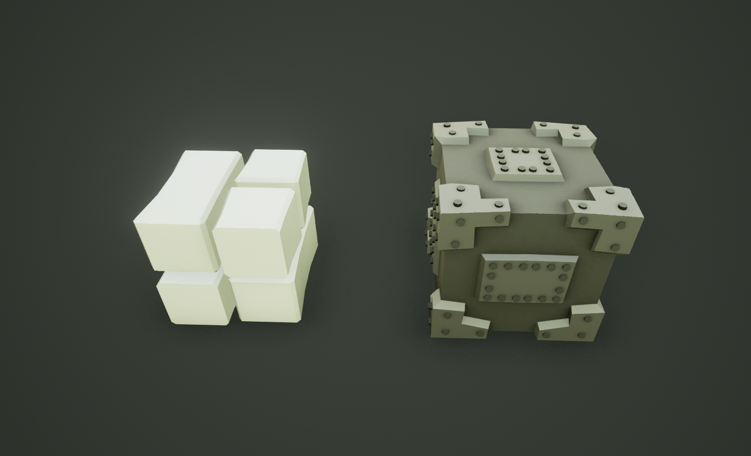
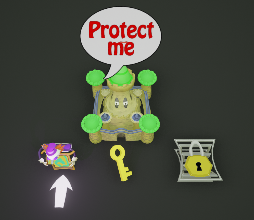
Shown above are the components of the Level Design of Toon Mayhem. The left picture consisting of the core building assets (Destructible and Indestructible) blocks. As the names suggest, the concrete blocks (left) are destroyed by Bullets, Mines and Bombs, while the metalic blocks (right) can not be destroye by any means. The choice to have indestructible blocks was to help give challenging and fun levels that players navigate while also presenting limitations and obstacles for them to overcome. The right picture consisting of the extra gameplay blocks such as: Player Bases, Portals, Keys and Locks.
Above are images of the finished maps implemented in the submission version of Toon Mayhem. Throughout developement designs have been iterated and tweaked during tests, moving indestructible and destructible blocks aswell as adding other interactables to increase playabilty or removing others to decrease clutter so as not to overwhelm the players.

The above shows the mechanic used to alter the health HUD that appears above the heads of the players.
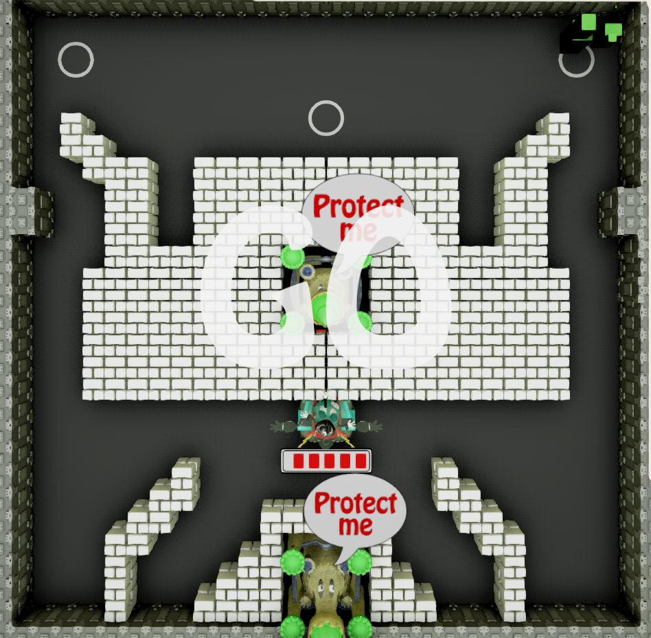
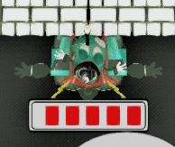
I drafted and prototyped several UI's for the players before finally settling on the final idea. Taking some inspirations from a project I was working on at the same time "Fall of Civilization" I decided to implement a minimalistic HUD that only told the players core information and allowed them focus on gameplay. The HUD was projected over the players heads insteade of a static area of the screen so the players focus could remain on their tank at all times without worrying above having to look somewhere else and risk being attacked while searching for their health.
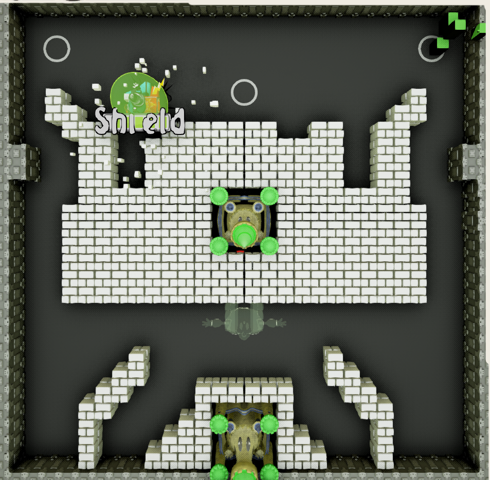
There are two visual traits that happen when a player picks up one of the various powers that spawn on the map; the block is destroyed and text appears above the pickup reaffriming what the player now has.
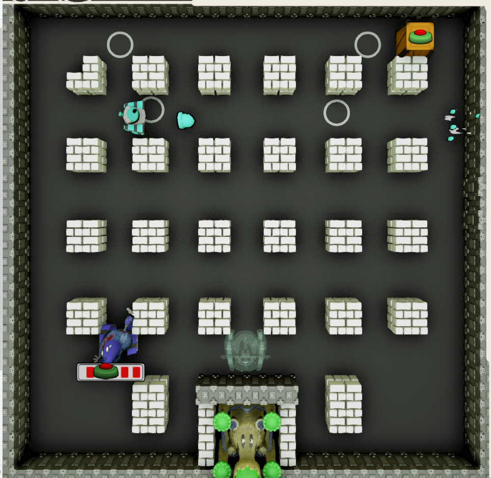
Some powers are not activated immediatly like the health or attack speed, some you can hold onto and choose to use when is most convinient for the player. So in this case, I thought how do you show the player they have this power so they dont forget? Keep the focus where it needs to be, on the unit the player controls.
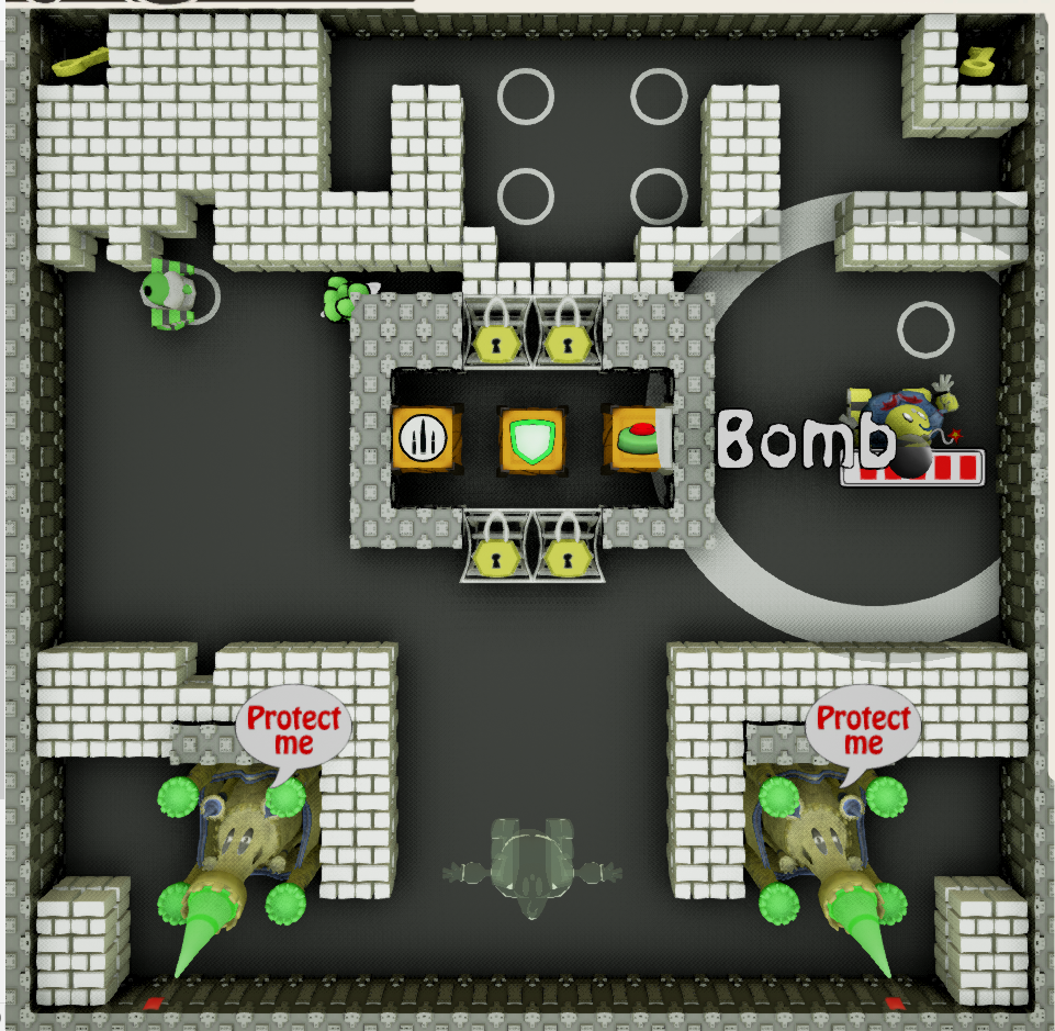
The Bomb pick up allows the player to destroy: destructible blocks, tanks and pick ups in a range around them. It was decided this was best visually represented by showing a decal for the range of the bomb while the player had this particular item equipped.


