The Burning Chain
The Burning Chain is a Single player RPG game designed for handheld platforms with Strategy elements.
Play as a group of adventurers as they start their own guild and begin gaining renown. Living in a world full of strife, monsters and warfare always means business for your guild. Explore the world, fighting dangerous creatures and build up your guild.
The Burning Chain is designed as a proof of concept with a full Game Design Document as well as Core Game Mechanics prototyped, shown and discussed below. This project was done entirely by myself over the course of one full week and the prototype was made in Unreal Engine 4.
This game is designed with constraints for solo development over the estimated period of 6-12 months, with an earlier soft alpha. Maintaining the scope of the game and its mechanics are the highest priority; to ensure speed and productivity while retaining quality, I have established a limited amount of polished features that would work well with the mobile platforms and the development time. The full GDD is in the embedded document below, showcasing my ideas and examples of my design processes as well as detailed information on the games core mechanics. The document will update as progress continues.
As the solo developer and designer, I effectively took the role of Technical Designer for this project. Conceptualizing the features detailed in the Game Design Document and implenting all the aspects of the prototype as detailed below, including but not limited to:
- Character Creation
- Turn Based Movement
- Vendor System
- Interactible Locations and NPCS
- Combat
Some of the aspects planned in the Game Design Document but not in the prototype, including but not limted to:
- Base Customization
- First Mission
- Nemesis Interaction
- Conditional Random Encounters
- Relationship with NPCs
These were not included in the prototype because they were not essential for Core or Secondary Game Loops or the Minimum Viable Product. I will be going over the Character Creation system through its three core mechanics Appearance, Attributes, and Class during its developement and discussing its port onto the Android Platform.
Appearance
To allow for a high amount of customization, the characters appearance including name, race and gender has its own screen. Name has a character limit, which is currently 24 for the sake of space on handheld devices. Race and Gender use dropdowns for two reasons; to effectively manage space (giving more space for tooltips) and so I can effectively add or remove races without having to alter any of the UI. The buttons when selecting between body pieces and colors are largely sized to make things easier to select on smaller screens. To increase customization and replayability, I want to make characters as interchangeable and unique to the player as possible. Which is why I decided to include 5 switchable character aspects (Head, Hair, Body, Arms, Legs) aswell as a variety of color selections for each respectively. I decided to combine the upper arm and lower arm, aswell as upper leg and lower leg. This is to keep synergy and aesthetic between the upper and lower parts and not flooding the player will potentially too many options. I made the creation system in such a way that you can add or remove pieces of customization without impacting the system. So if you needed to remove a set of armor, just remove the items from the respective arrays. if you only wanted to give the character a choice of 100 bodies, 10 arms and 2 legs, that would be possible.

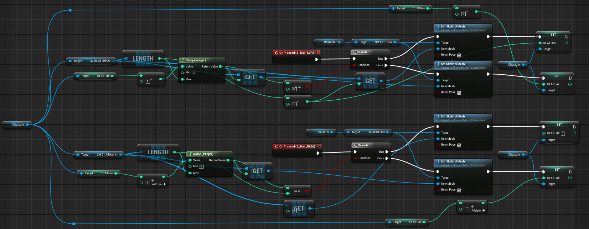
This shows a section of the character creation system, switching the characters hair. This method is applicable to the other switchable character parts. (Head, Body, Arms, Legs) Initially checking to see if the player has reached the end of the list, if they have the selection goes back to the first item and continues to loop through. The part of the character is swapped out of the new item, in this case swapping out the current hair to the next selected hair and then setting the index so it can be referenced later if needs be. This is one of the more simple examples to show, others featuring more variables and branching based off; color, gender and if you are swapping more than one item at once (upper arm + lower arm / upper leg + lower leg)
Attributes
The stats section of Character Creation takes inspirations from tabletop gaming, Dungeons and Dragons in particular. The point buy system gives you 10 points to spend and all your [attributes] start at 0 unless your races gives you special circumstances, for example: [Human] Characters give you +2 Charm and -2 Wisdom at the start. Because no stat/attribute can be lower than 0, 2 out of your pool of 10 is automatically taken out but this is balanced by having your Charm increase to 2 and can not be decreased lower than 2.

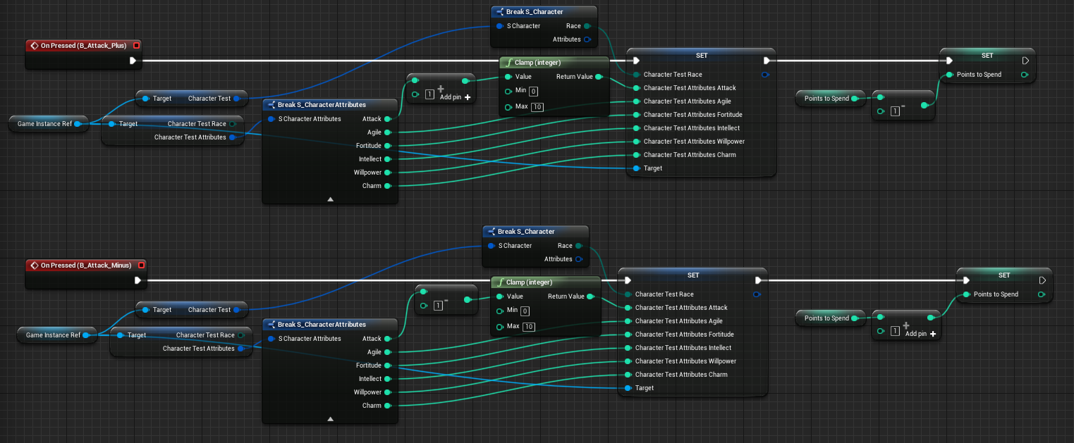
This shows a section of the attributes system, increasing and decreasing one of the 6 scores, Attack. Pretty simple in the funtionality, increasing or decreasing a value based on the number it currently is while also adding or reducing the amount of points the player has left to use as a whole, respectively.
Class
The Class system of Character Creation has been made as modular as possible within the UI and its code. If classes are added or remove, the UI will scale appropriately to add them in. There is however a variable controlling the maximum amount of classes addable, this is for the sake of not flooding the UI and making too many options that become cluttered and unreadable. Class Selection, Presentation, Starting Equipment Sets and Starting Abilities are easily changeable for the developers/players preferences. Class Selection is done via Presentation is done via Starting Equipment is done via Starting Abilities is done via

This shows the mechanic that controls the class list and its interactions. It enables me to to add or remove classes easily with little extra changes needed. First establishing a reference and getting all the classes I have from the Classes variable, for each one creating a new widget with a button that when clicked calls an event that sets the new class aswell as changes the idle animation and weapons of the character on the screen.
Attached is the embedded version of the Google Doc used for the Game Design Document, containing things like Design Pillars, Core and Secondary Gameplay loops, Gameplay, Narrative, The World, Art etc.
Due to the decision to feature the project on handheld devices, making sure the performance was as high as it could be was an important aspect. With this in mind I chose stylized low-poly art that would look great on smaller screens but be nowhere as performance demanding as AAA counterparts.
I decided to make this a 3D game despite the trend of mobile games being 2D because that fit better to my capabilities, experiences and the assets available to me.
Initial tests into performance and deployment to handheld devices provided alot of useful feedback in terms of design and opto. As I have an android device that is what I used for these tests. Simple screens like the main menu and character generation transitioned to android with ease and required little changing to get working besides orientation and UI changes to make the most effective use of the screen space. However the more visually compelx areas of the game, the world map and combat needed more testing and balancing to ensure a good amount of stability between quality and performance.


